When I first joined Brigit, one of my first assignments was to help port all of our design work from Sketch to Figma. This case study showcases all the design infrastructure I did over the months to enable my team to work faster and with more consistency.
We noticed significant drop-off when users were being asked to enter their Personally Identifiable Information(PII) within our onboarding funnel.
More specifically, our users were hesitating at the SSN screen. 20% of users decided to abandon onboarding when they got to this screen.
Create and test an alternative way to ask for SSN during CB onboarding that improves conversion at this step in the funnel
According to this research paper by the Center for Victim Research, younger adults (a majority of our users) are among the most frequent victims of identity fraud. We hypothesized that users stop before providing SSN because: they are hesitant about providing this type of information. (for fear of their identity being compromised)
Therefore we need to design a new experience that lets our users now that:
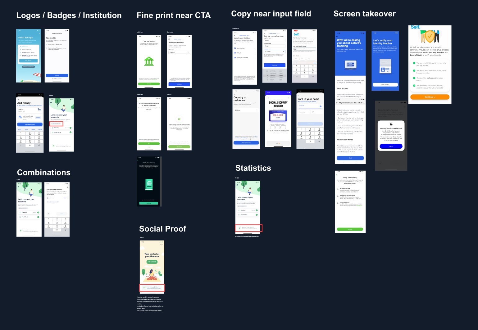
Every fintech company more or less collects the same information. I collected similar steps in our competitors' onboarding and grouped them by themes.
I usually start my ideation process with the solution most obvious to me. In this case, we keep the old screen and just add a "hey we secure our app with this fancy 256 bit encryption" element.
Next, I usually explain my reasoning through a pro and con column, so that we can weigh each decision against each other.
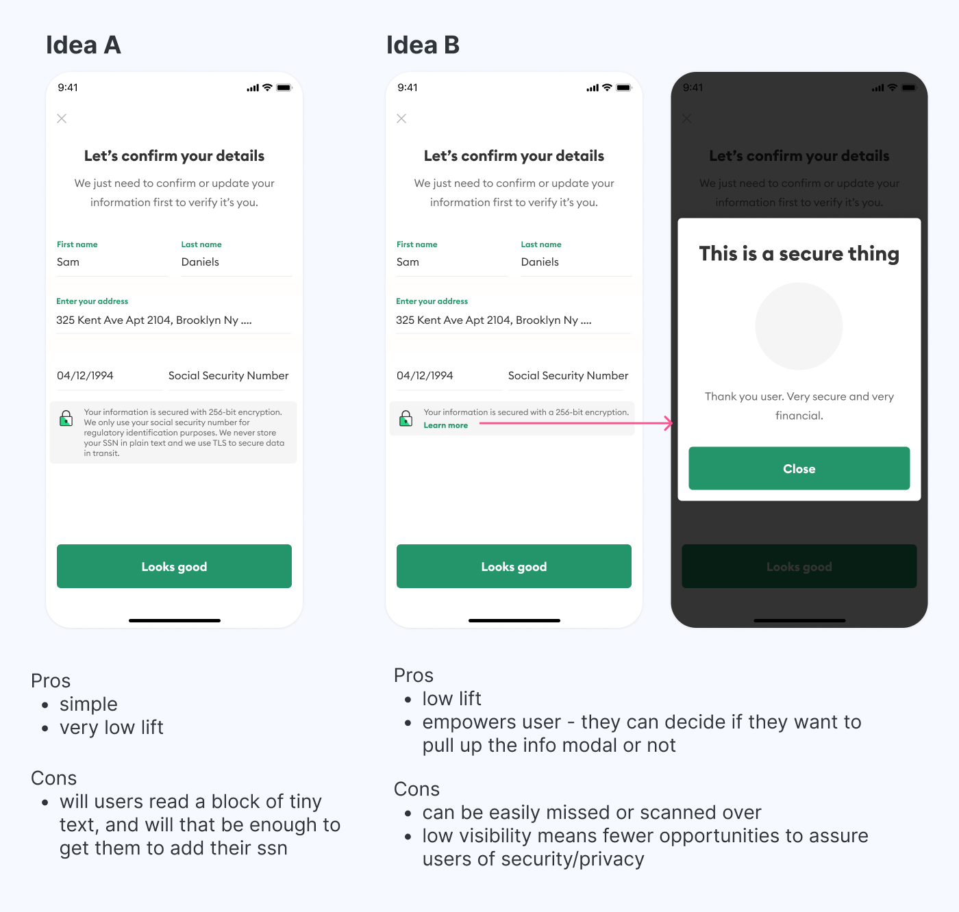
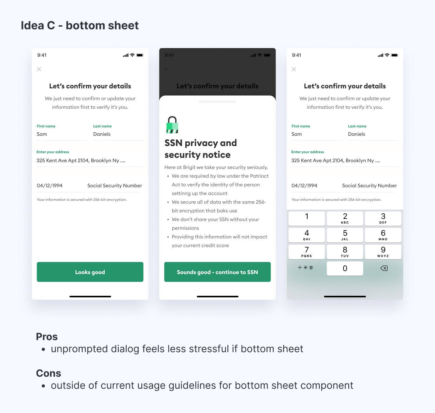
Next I explored a version where a bottom sheet would automatically pop up from the bottom unprompted to solve the visibility issue from design B above.
It got shot down because it didn't comply with our design component guidelines(that I helped write lol), but I thought it was worth exploring anyway just to see what it looked like.
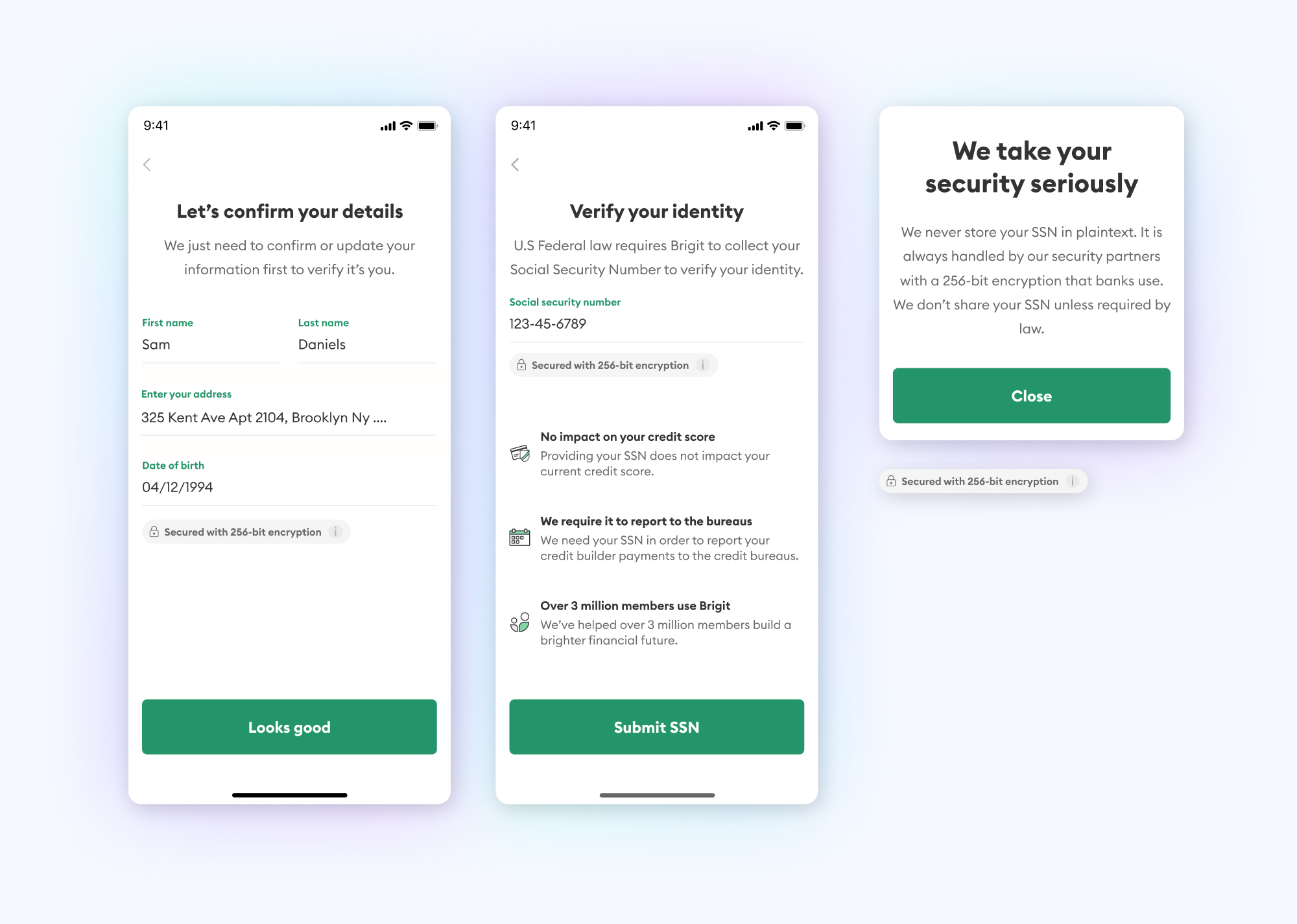
After thinking about the problem a bit more (and spending time on other projects) I can usually come back and think of a much better idea than A. In this case I propose giving the SSN entry its own screen.
At this point I show the iterations to the rest of the team and get their feedback on it.
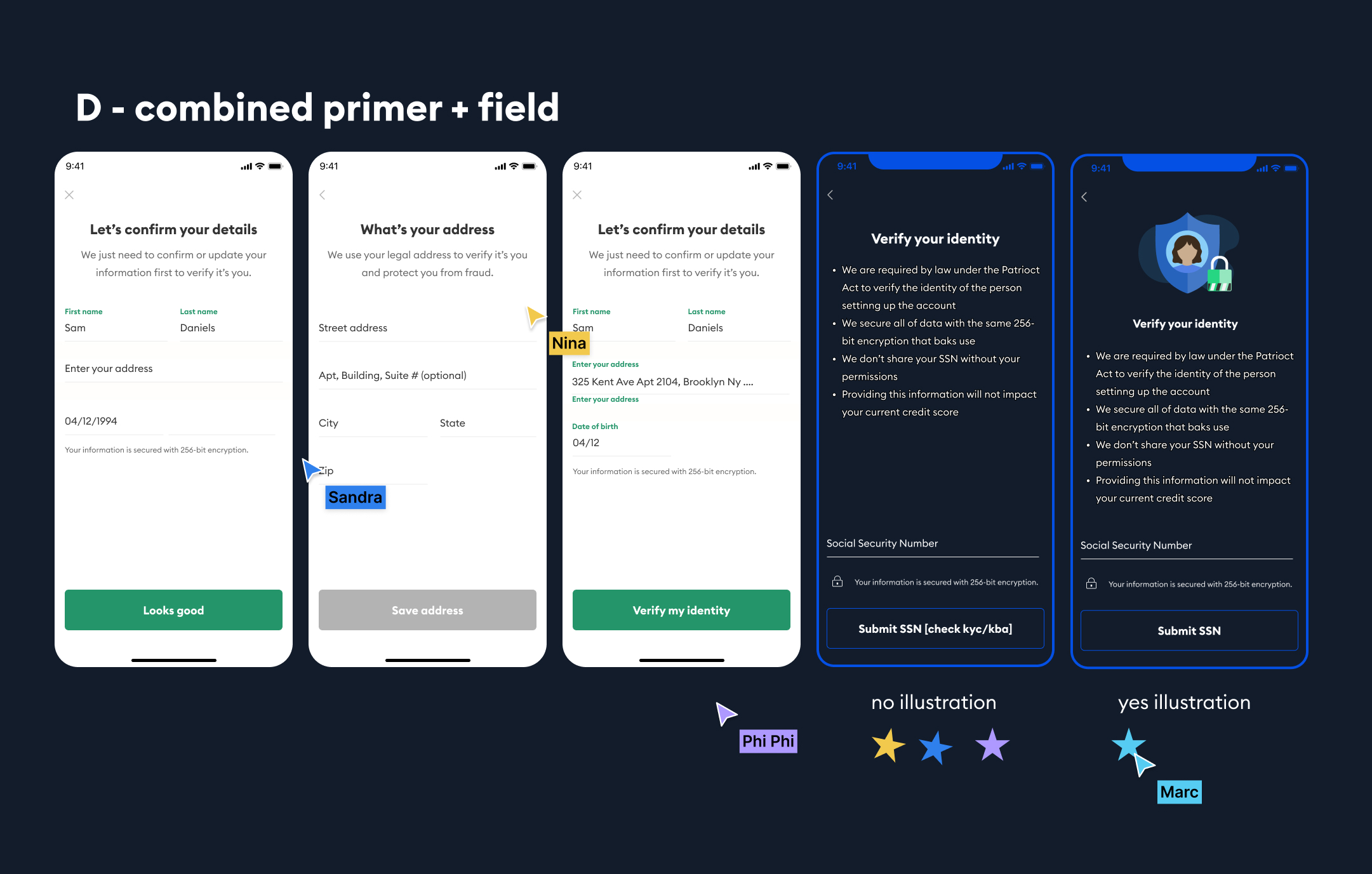
Overall the idea was well received, with some further discussion and refinement, but at this point the team pretty much agrees on the general direction of the experience.
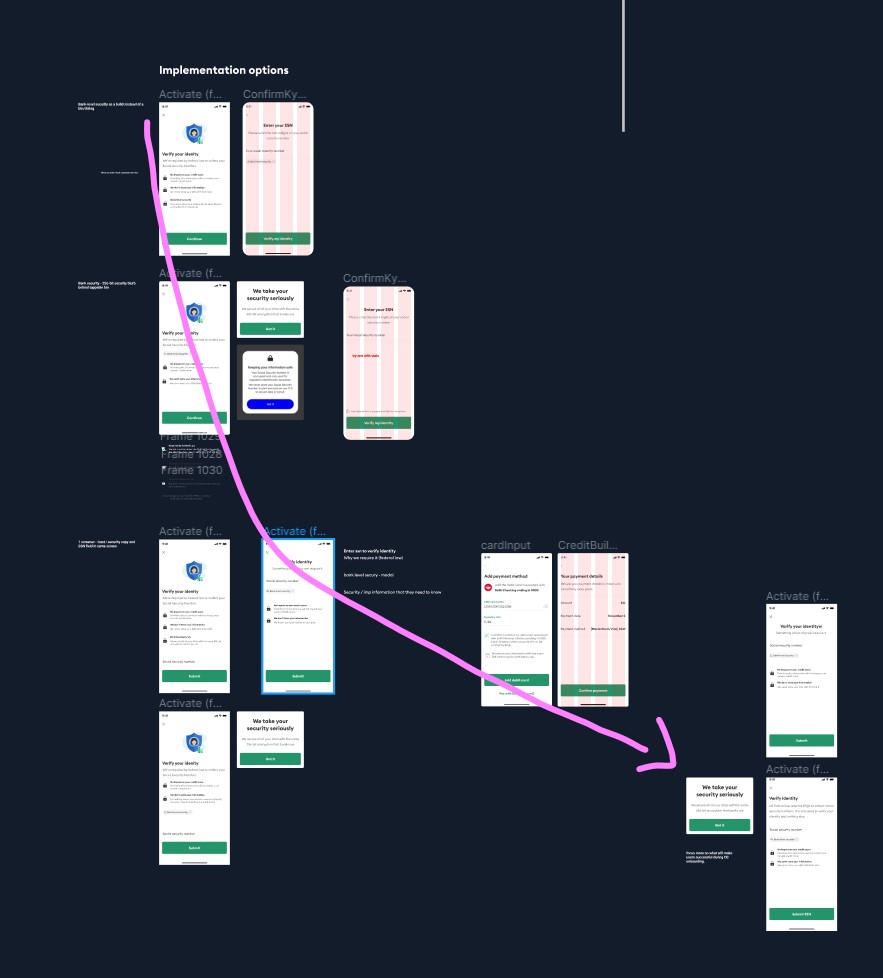
At this stage it's nitpicks and copy/compliance discussions. I pushed pretty hard for the illustration but it ended up not making the final cut.
User test research doc
Note: full PDF of the research doc can be found here: link
This research doc reflects the ticket that was scoped ahead of time (I love my PM) so I didn't have to do much of my own writing as far as background/context, but I did write the research objectives and designed the experiment myself.
After writing the script, I conducted user interviews to fulfill the research objectives.
It takes 5 tests to establish a pattern; I conducted 7 just in case.
After I transcribed the notes, I summarized my top learnings from each individual and laid them out in sticky notes in Figma.
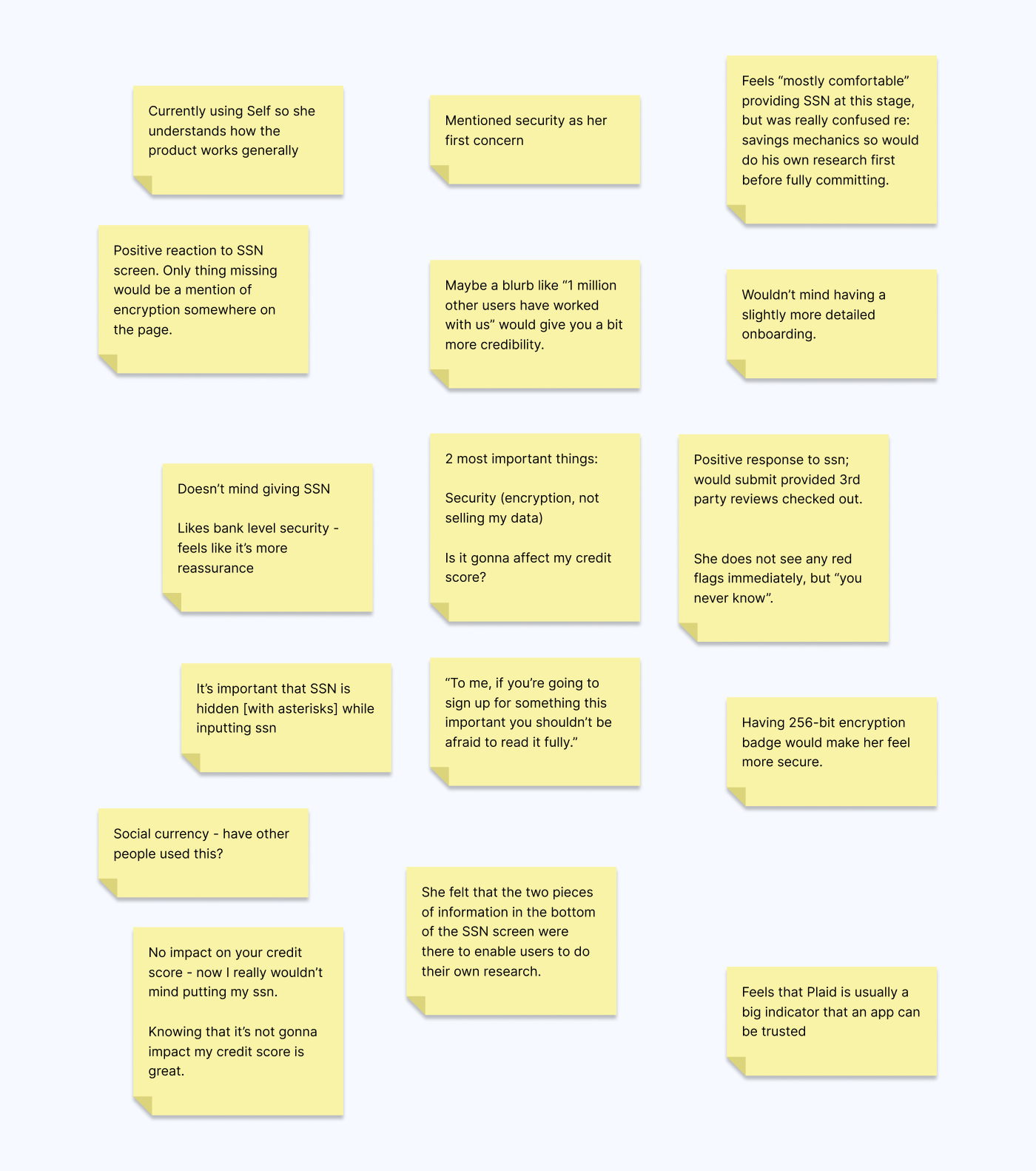
To sort through this information, I affinity mapped each data point and grouped them by categories to identify the most important takeaways
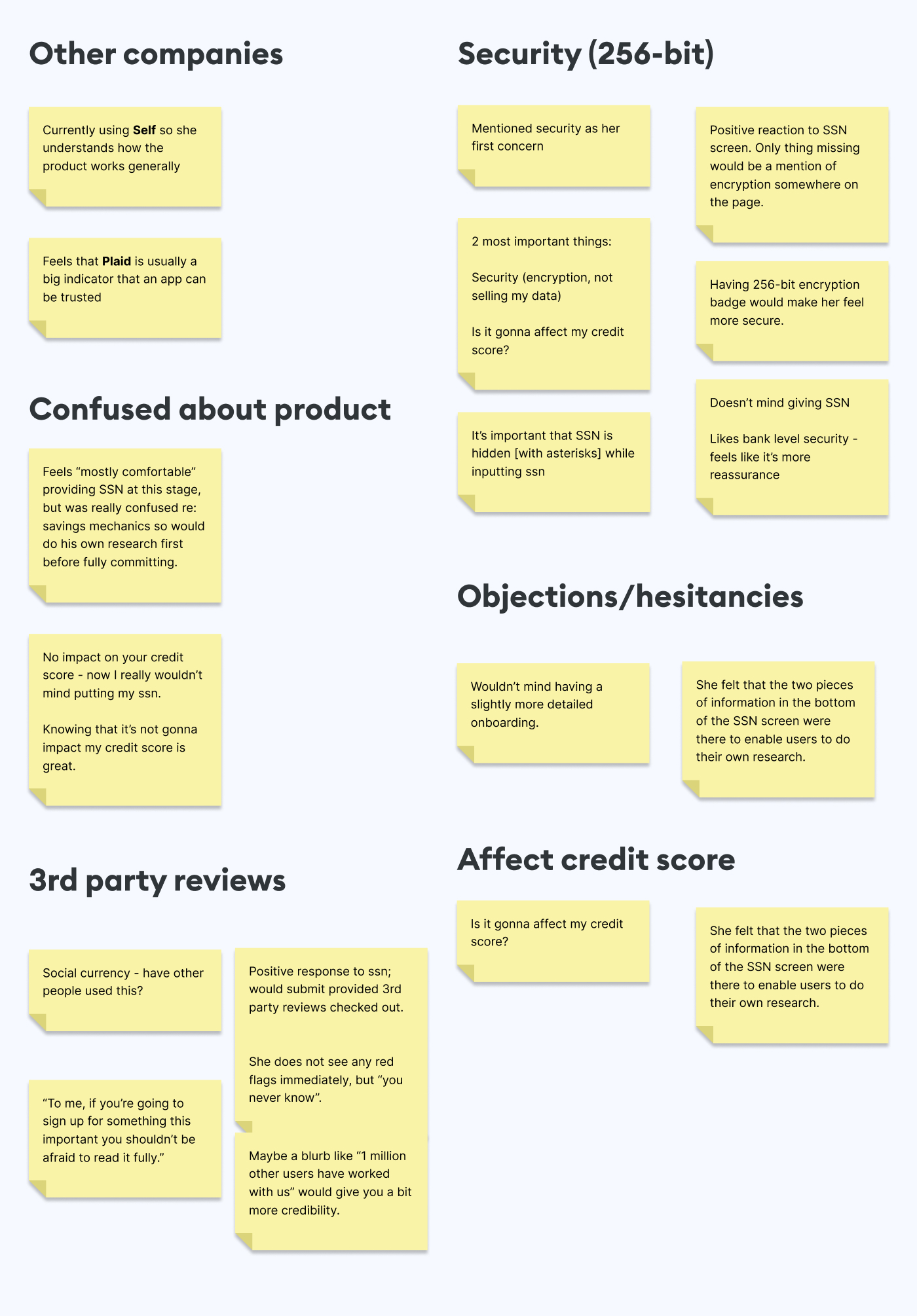
After grouping it this way, it became apparent that security, social proof or not it would affect their credit scores were a top priority for our users.
The most important parts of this screen to address and possibly remove friction could be boiled down to these 3:
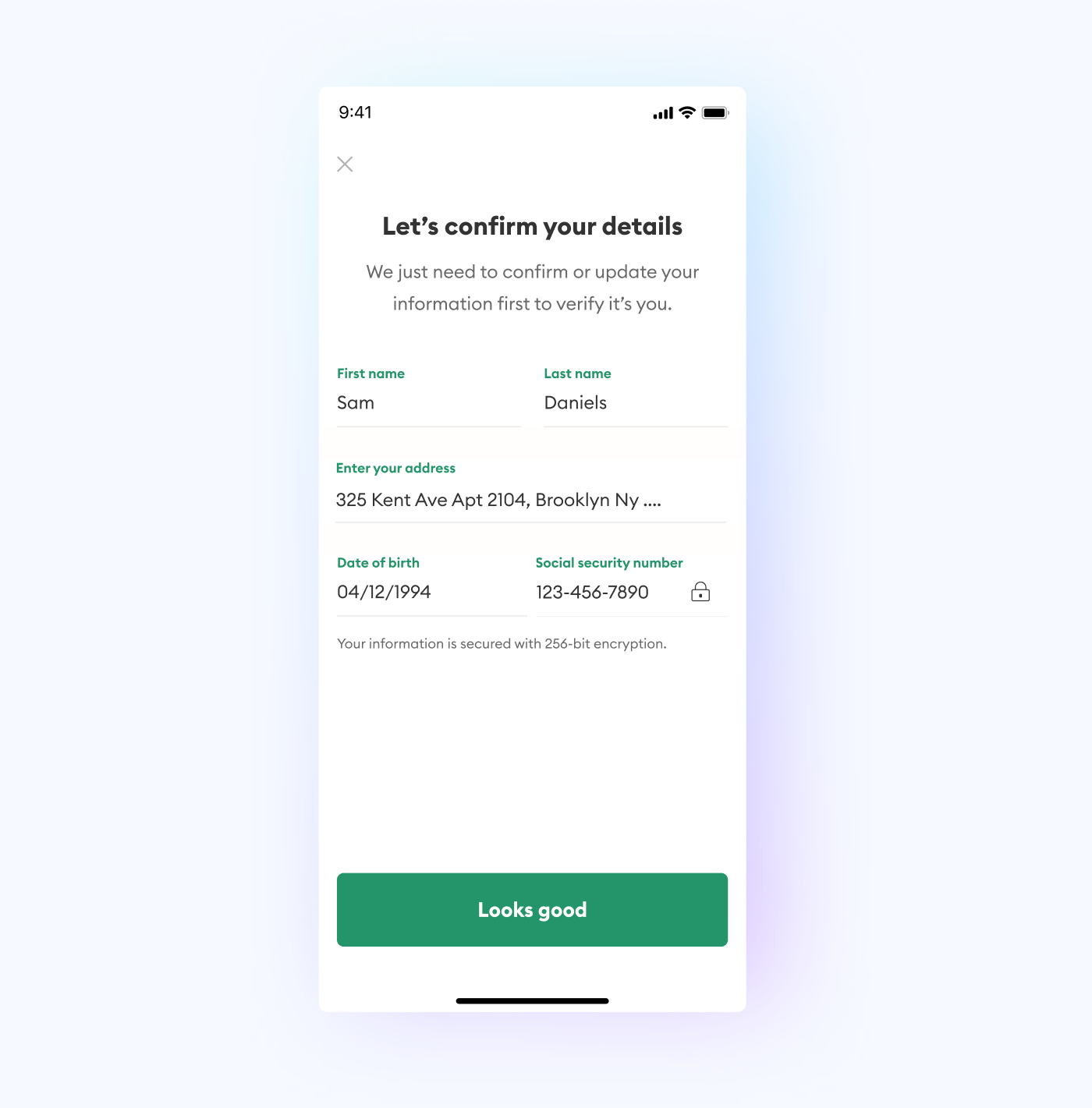
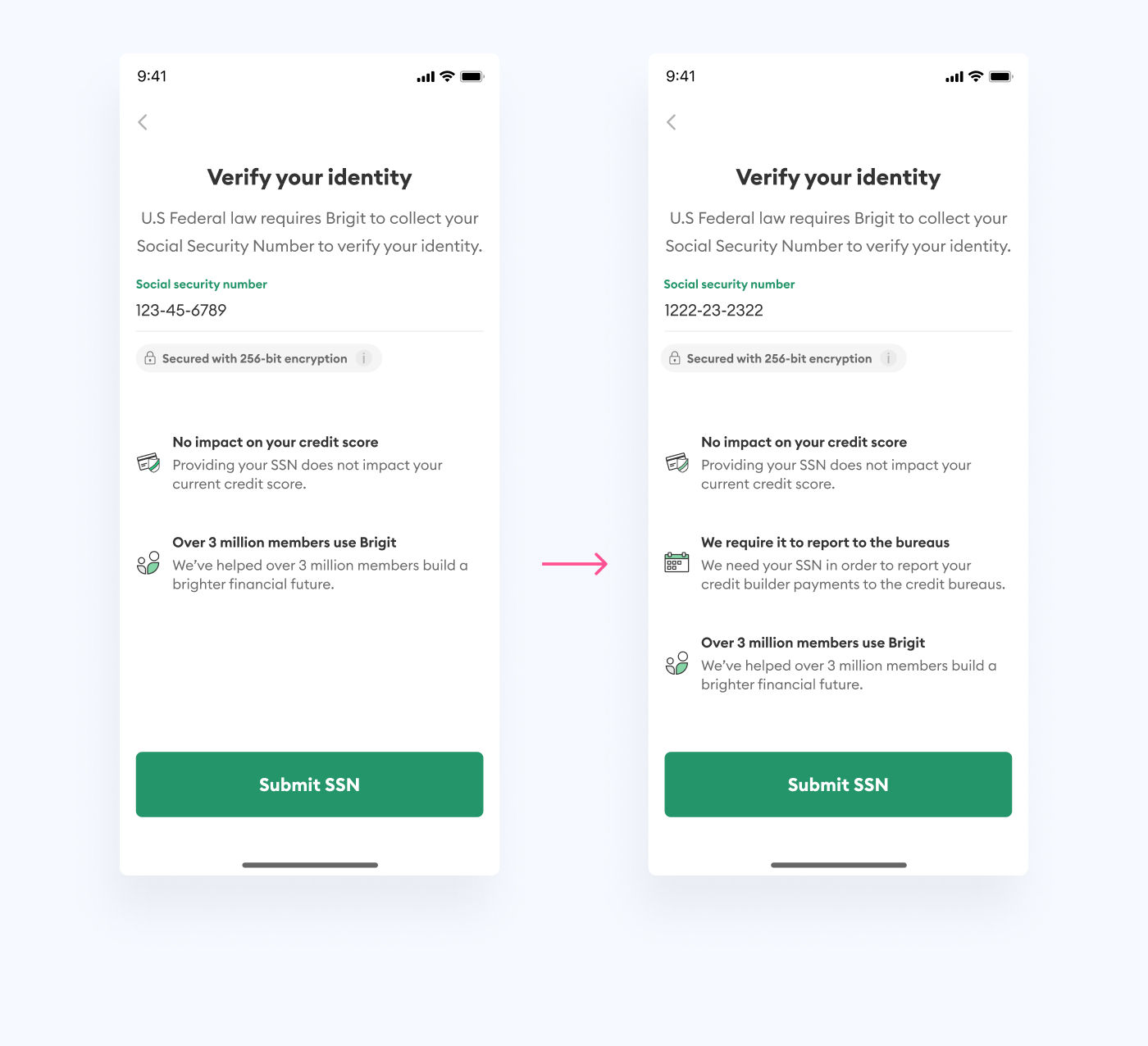
After a few more rounds of design review, this layout was approved. I created new icons to fill out the placeholders and cleaned up the overall layout for more breathing space.
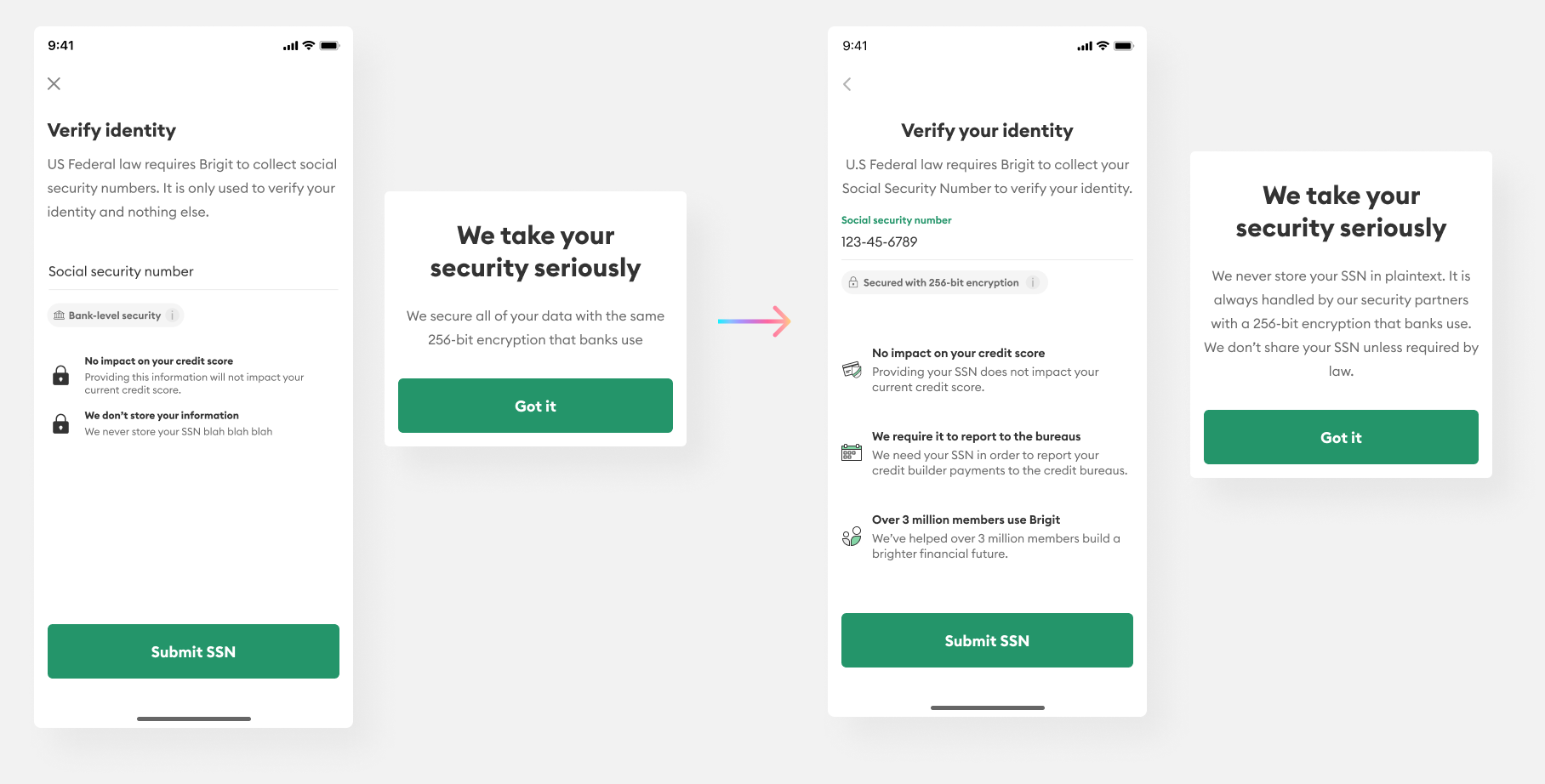
We had to add a 3rd bullet, "We require it to report to the bureaus." to let folks know why we were collecting this sensitive information.
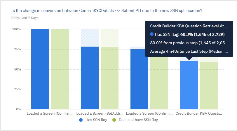
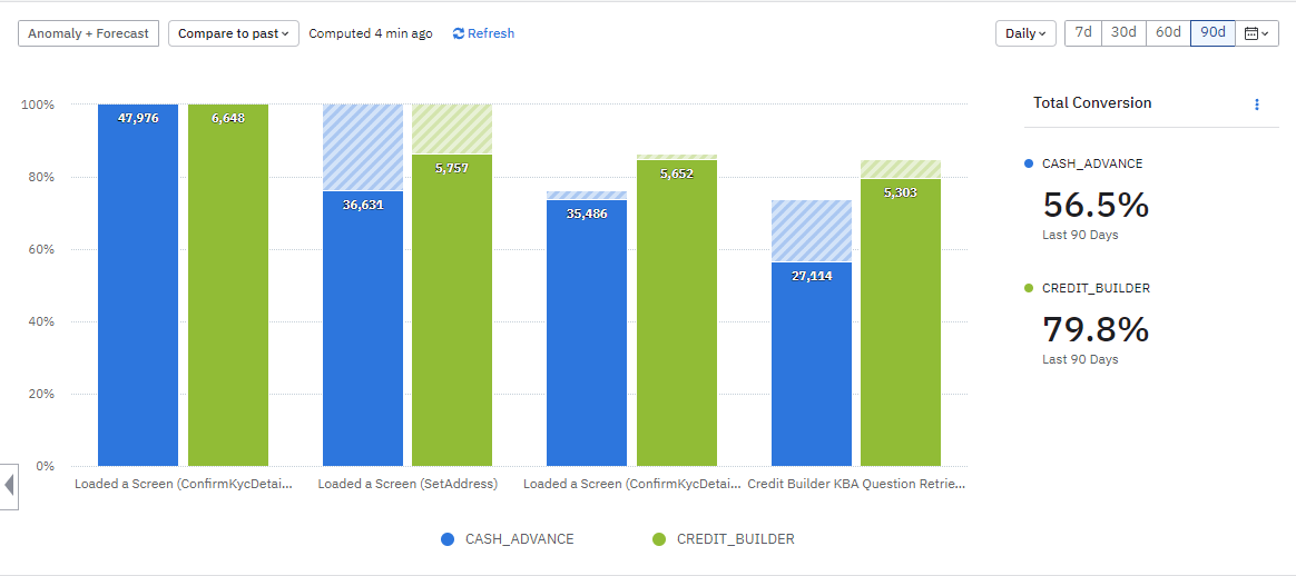
As of writing this case study we're still collecting data on improvements, but we've already seen a 3-4% conversion increase overall according to our Amplitude funnel.
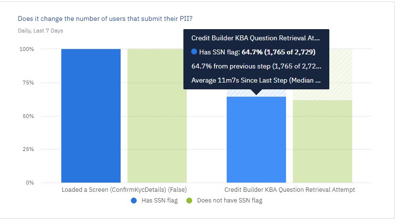
As of now, disappointingly, no, but it has only been a week since we launched.