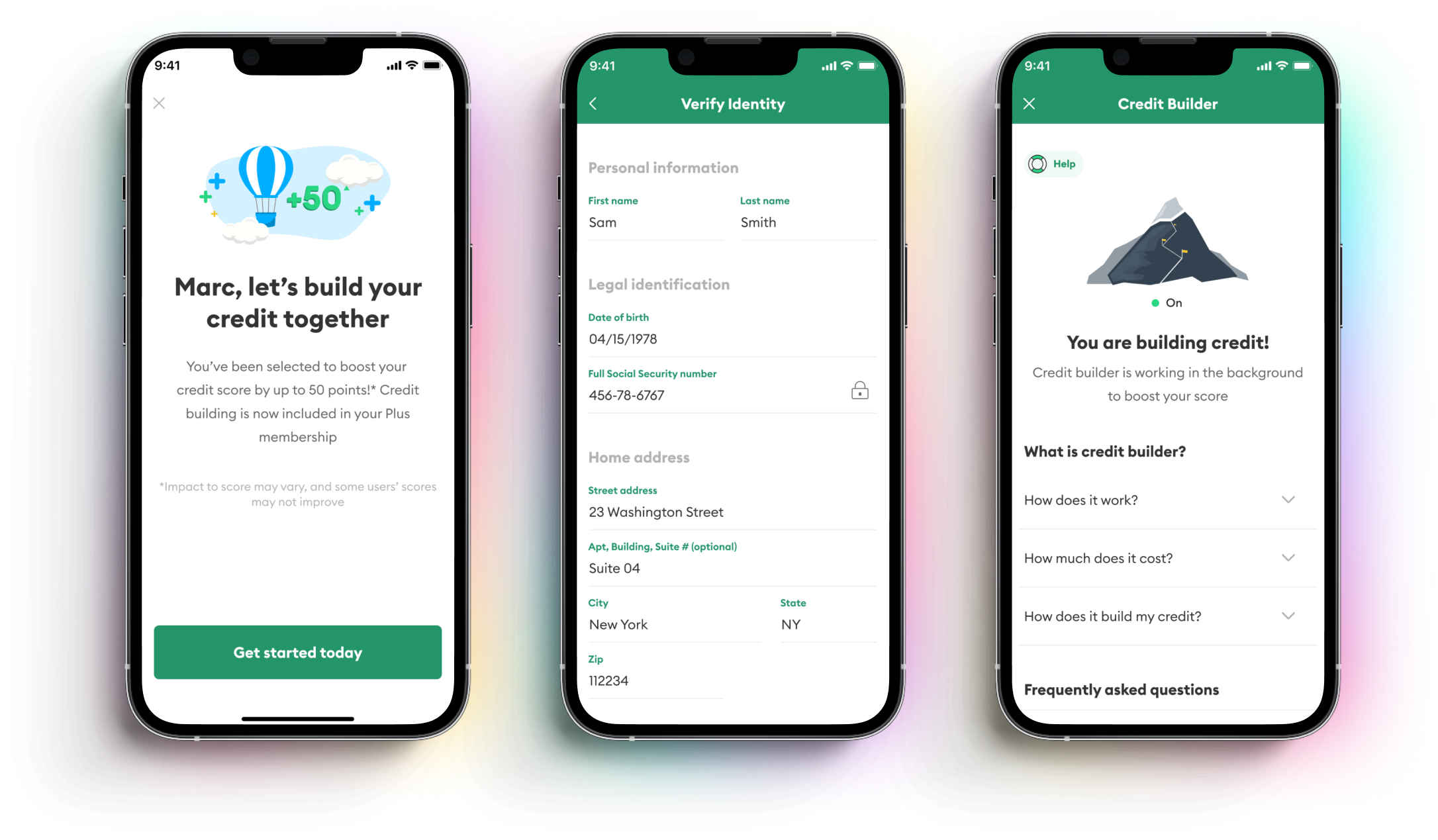

An overview of how we launched credit builder, from initial design sprint to V1.
Product: Credit Builder by Brigit
Deliverables: UI, Illustrations (key art), Research & documentation
Role: Product Designer, Illustration
26 million American adults are considered to be "credit invisible" - meaning they have no credit history, and therefore fail to qualify for access to auto loans, mortgages, rent, certain jobs and other key services that judge your worth based on your credit score. In addition to the 26 million Americans with little to no credit history, there are also the ~40% that have "fair-good" credit scores that this product would also be able to help.
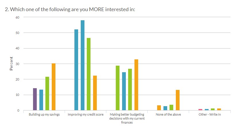
In multiple polls and research initiatives among different demographics, improving credit score consistently polled at or near the top of most requested services for Brigit.
Our mission: help as many of the 26 million "credit invisible" Americans as we can get access to credit and ultimately financing. That's in addition to the 100+ million with what the big 3 credit rating agencies (Experian, Transunion, Equifax) consider bad credit.
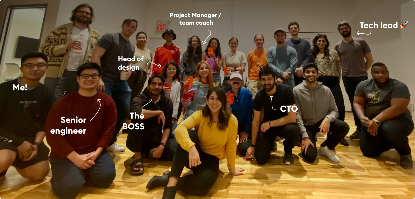
We had the research, statistics, and an idea of what to build, but no common vision and no defined product surface area. In short, we had blue skies, and we needed constraints. The best part about this project is we got to define that ourselves.
With respect to time, I'm not going to go over the entire 7 days, but I'd like to pull out what I felt was the decisive moment in terms of product vision for the process.
The prompt of this activity was concept brainstorming; each member of the team comes up with a concept or a metaphor of how the product would work.
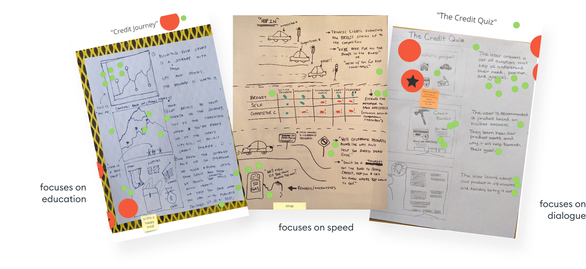
The top 3 concepts focused on:
Education and Guidance: Building credit as a journey - you climb a mountain and we are your guide
Speed: Building credit as a highway commute with stop signs, forks, turns, and filling your car up with gas! (how creative)
Dialog-driven experience: you tell us what you need and we adapt the experience to you
Whilst the rest of the team focused on fast results, convenience, and education, I leaned toward a more human approach: send beans to people.
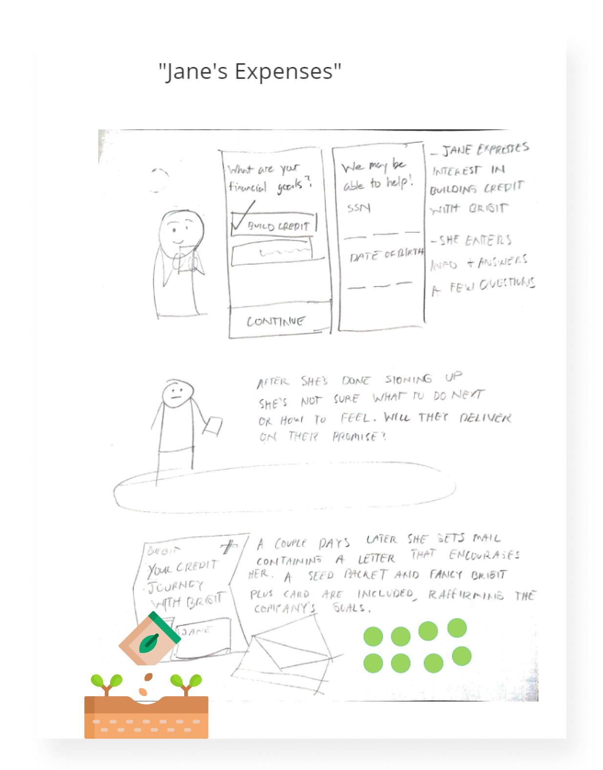
My reasoning is that finance apps all seem extremely transient and abstract. Let's go over the things that we know:
Like all ambitious ideas, mine was tossed into the "this is a great idea we'll put it aside for now" bin and we went with the wining concept of:
Building credit is a mountain you climb. Brigit will give you the plan, supplies, and financing to equip you on this journey.
You pay $10 a month. We loan you $40 a month, to a total of $50 a month, and then we report that positive credit payment transaction to the credit bureaus.
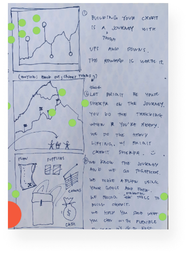
The concept we voted on ended up being credit as a journey - building credit as a metaphor to climbing a mountain - with us providing supplies, guidance, and cash to support your journey. At the time even I was convinced this was safe way to go about it. One reservation we all agreed on: climbing a mountain seems a bit exhausting and hard?
We conducted the concept discovery on day 3, day 4 is where I actually got to start working on making the delivarables. Here's an overview of the things I was responsible for designing:

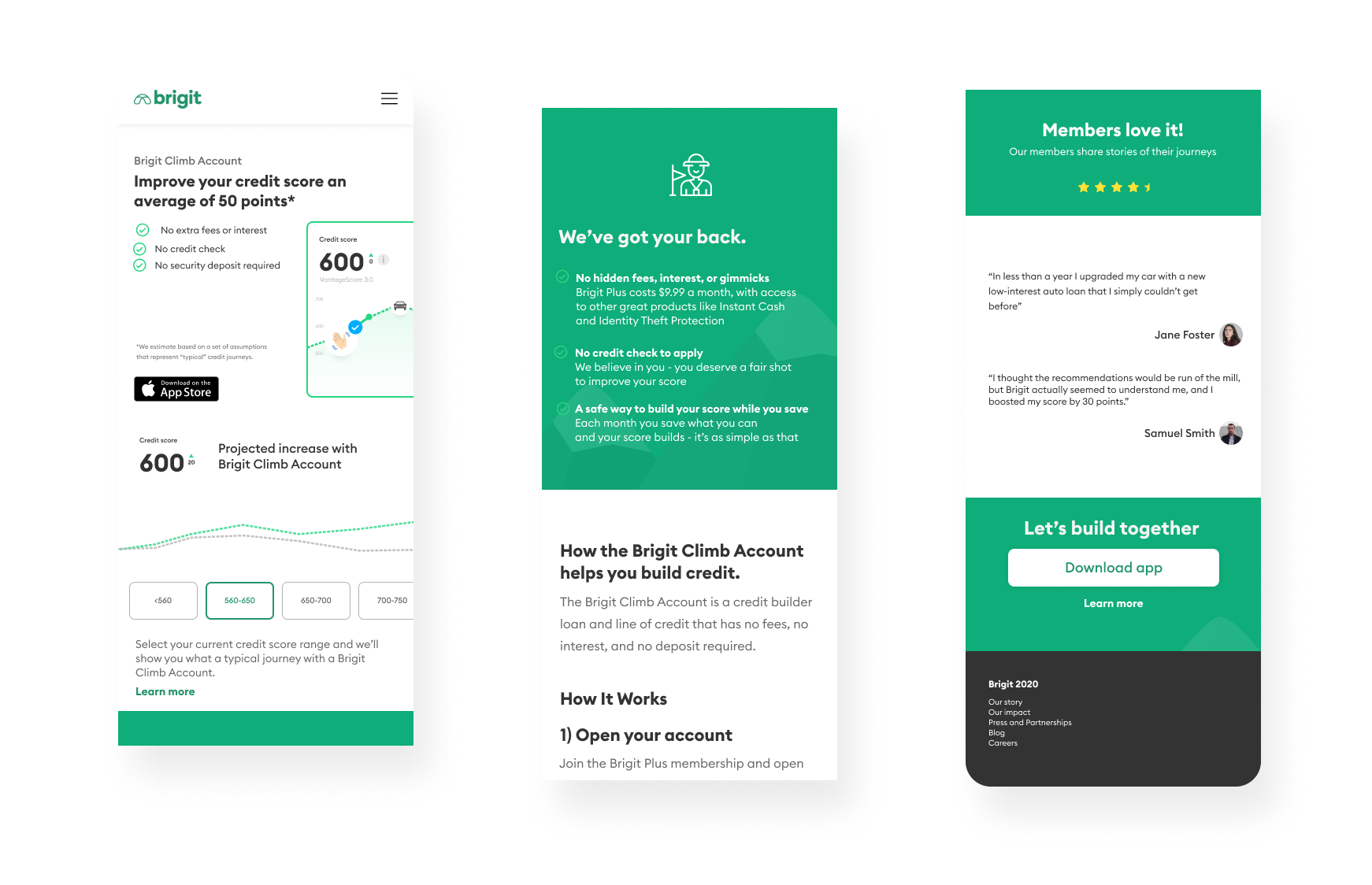
After some discussion, my team decided that this page should answer:
To respect resource constraints, I opted to use standard and modern landing page design patterns while retaining Brigit's branding. My thinking here is,
Since the content itself is so complicated, we should aim for the design elements to be as invisible as possible, while retaining a pleasant and familiar visual heirarchy.
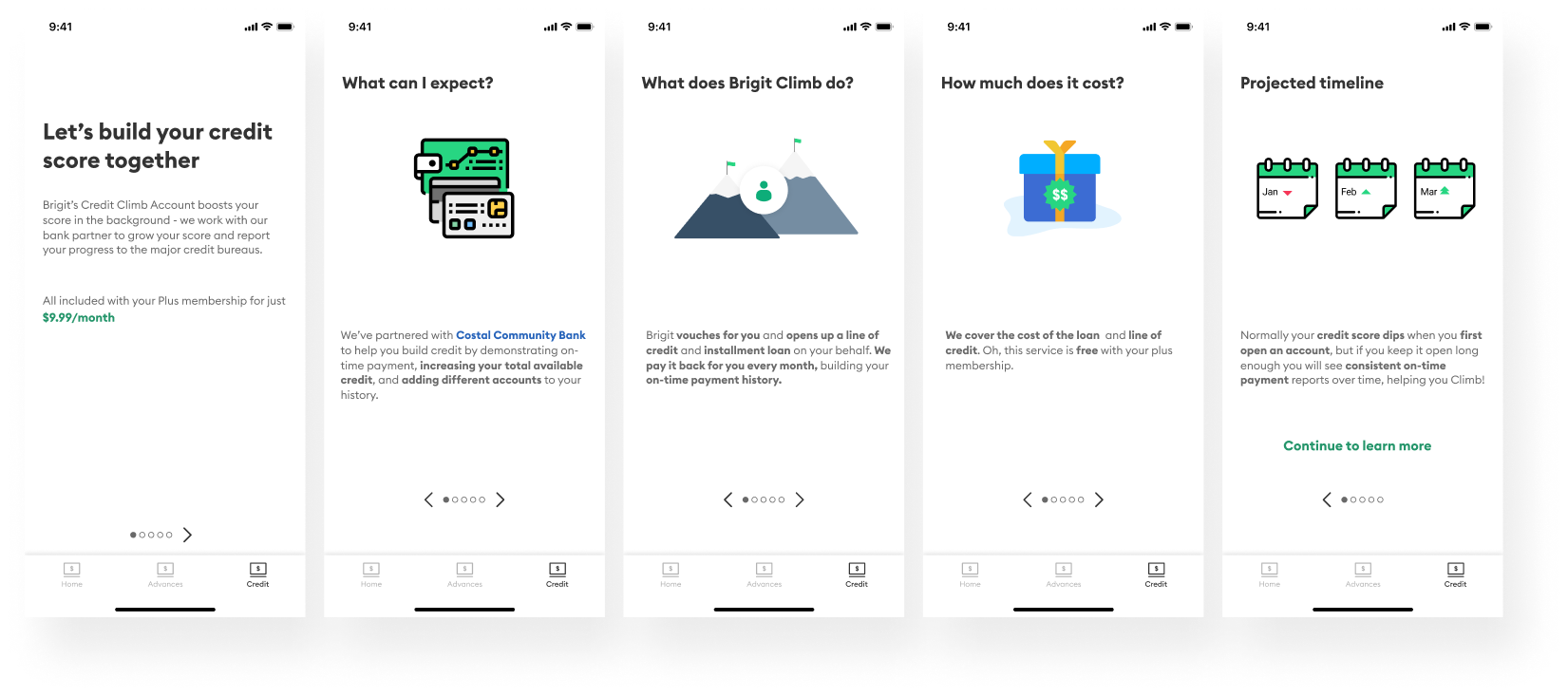
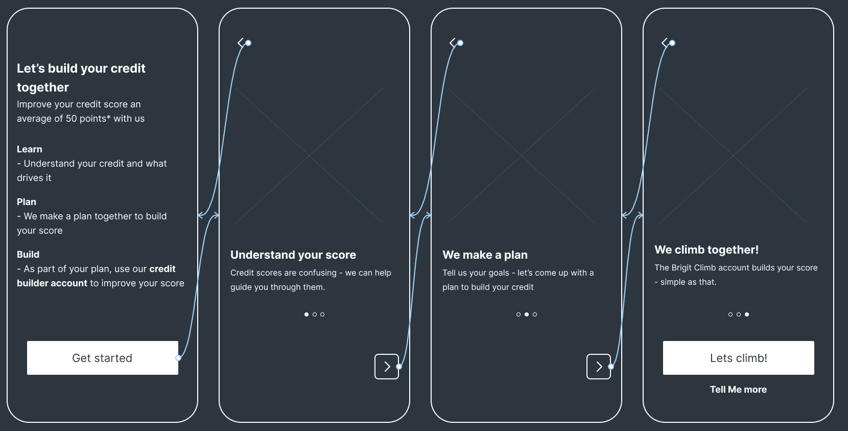
This was my first iteration. As you can tell, it is entirely too wordy, and with too many slides. No one is reading this. I suggested went back to the drawing board and redesigned it to be more “punchy.“ To my surprise, more than half the team agreed with me.
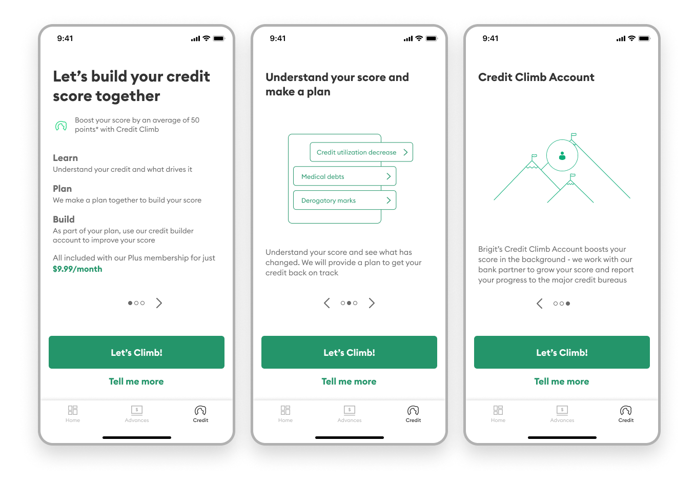
I took a much firmer lead when creating this version:
I never know what to say about prototypes, except that they are fun to make.
And after all that, all there was left to do is to test it. Can't wait until the results come in... 😪

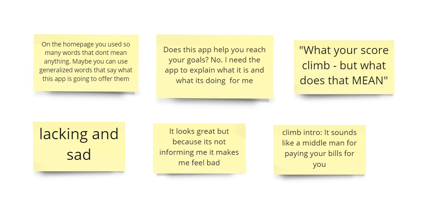
We tested the prototype with 7 users we recruited from userinterviews.com as having similar characteristics to our ideal credit builder population.
Their feedback could pretty much be summed up as:
At this point, we realized how much work we had cut out ahead of us. To my team’s credit (pun not intended), we were up against a couple things:
This wasn’t entirely a bad thing however; it led me to ask very important questions that I would spend the next few months answering:
The main question being: how do we explain this astoundingly complex financial product in a way the average person can understand?
Well, it turns out that question wouldn't be that relevant to me; my manager identified onboarding/product comms as a project that she should take the lead on. Therefore, we split Credit Builder into two parts: she would handle onboarding, while I would get to create the post-onboarding experience.
Next: Designing the credit builder experience (post-onboarding)